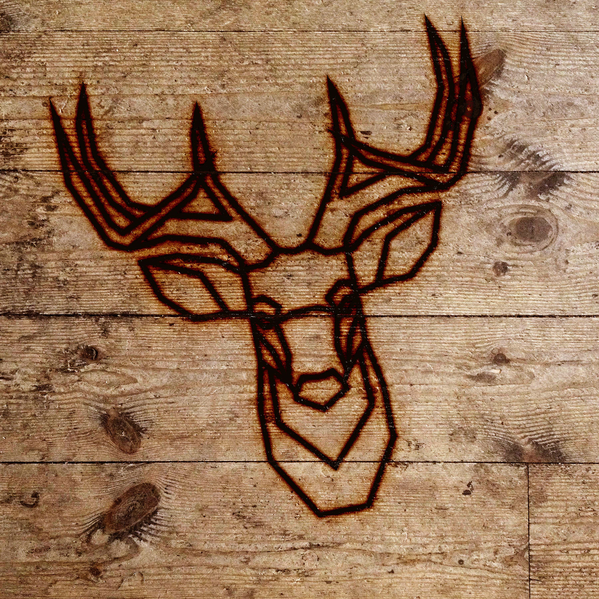
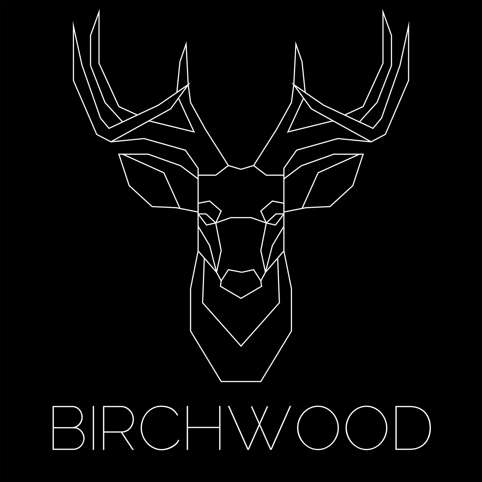
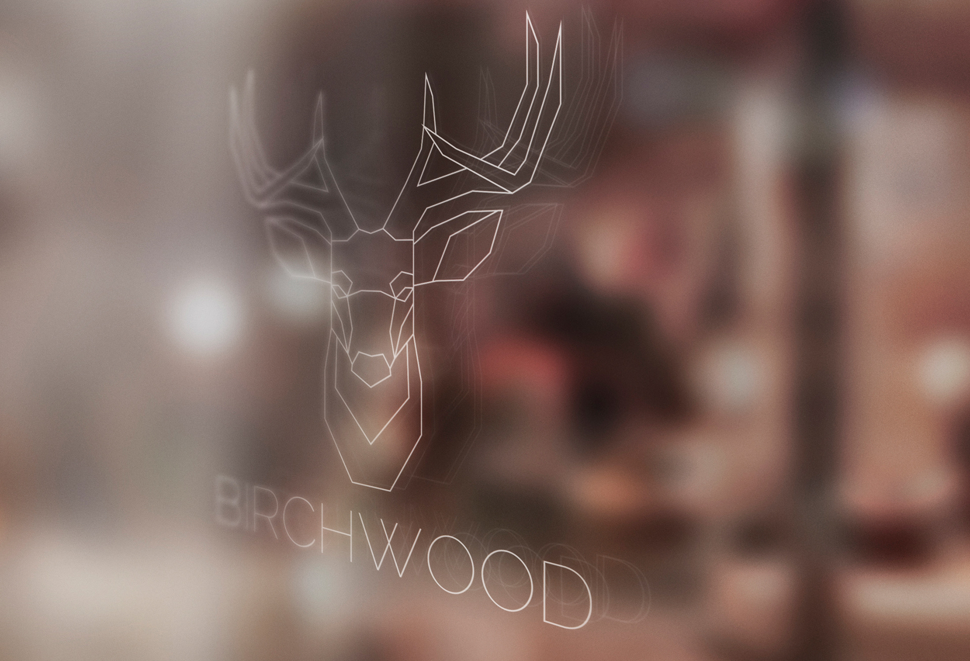
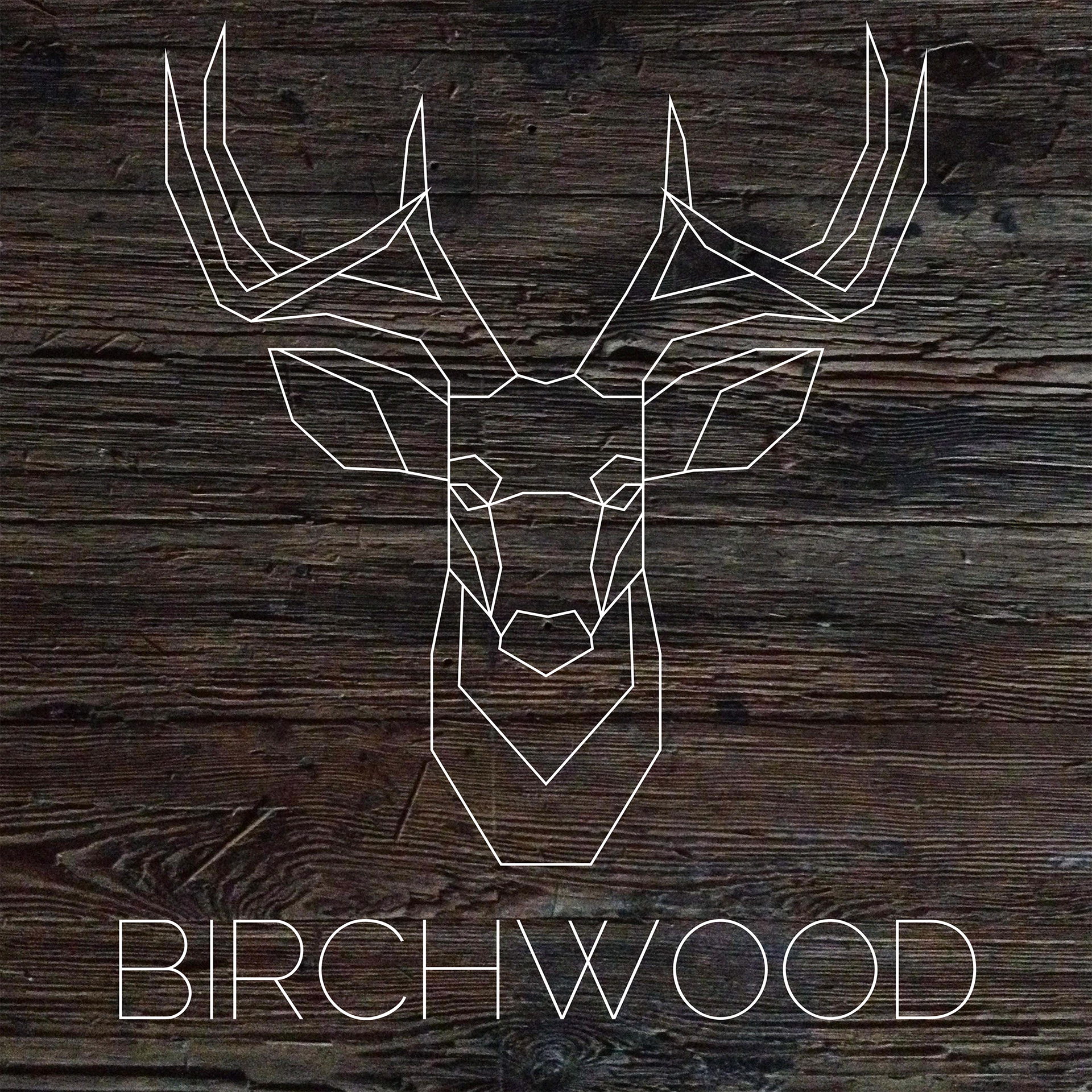
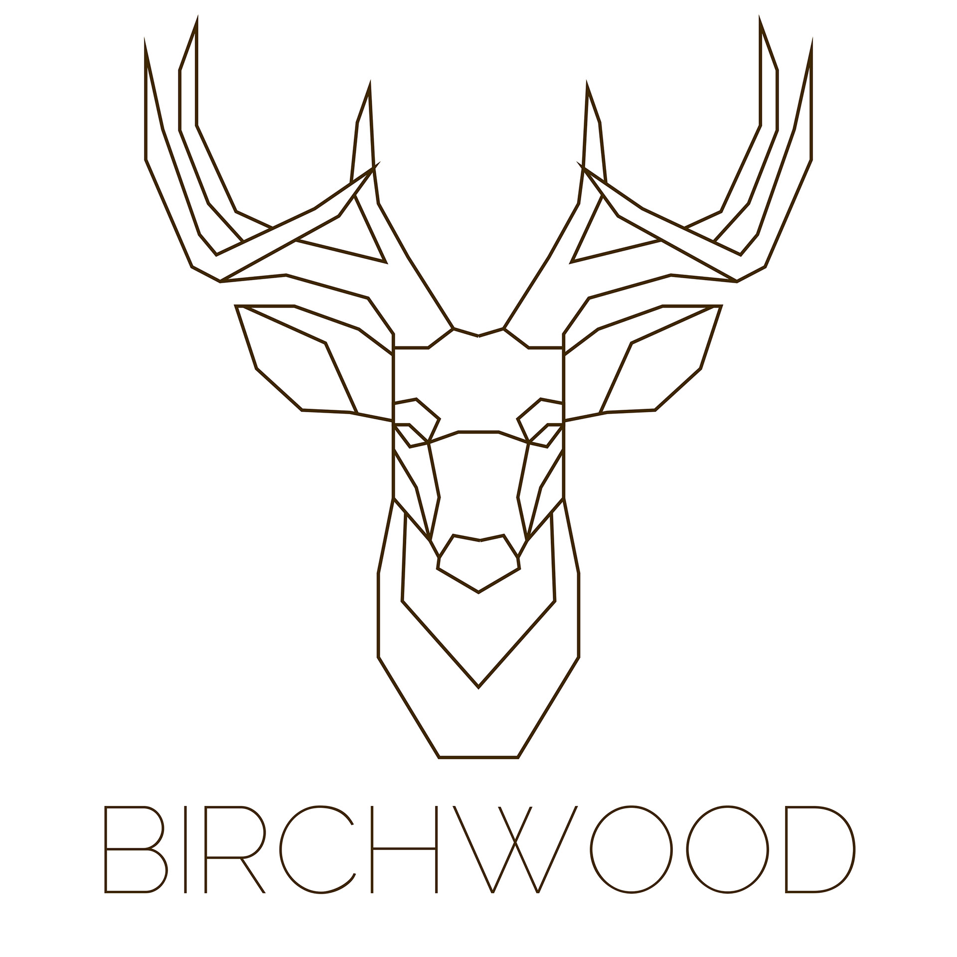
My initial task for this project was to create a logo and branding for a rustic, Canadian steak restaurant named “Birchwood” My first pitch to the client was a simple geometric elk design that would function as a logo and mascot for the brand. My concept for the design was to have it hot iron branded onto the wooden serving slabs and even possibly the steaks themselves.
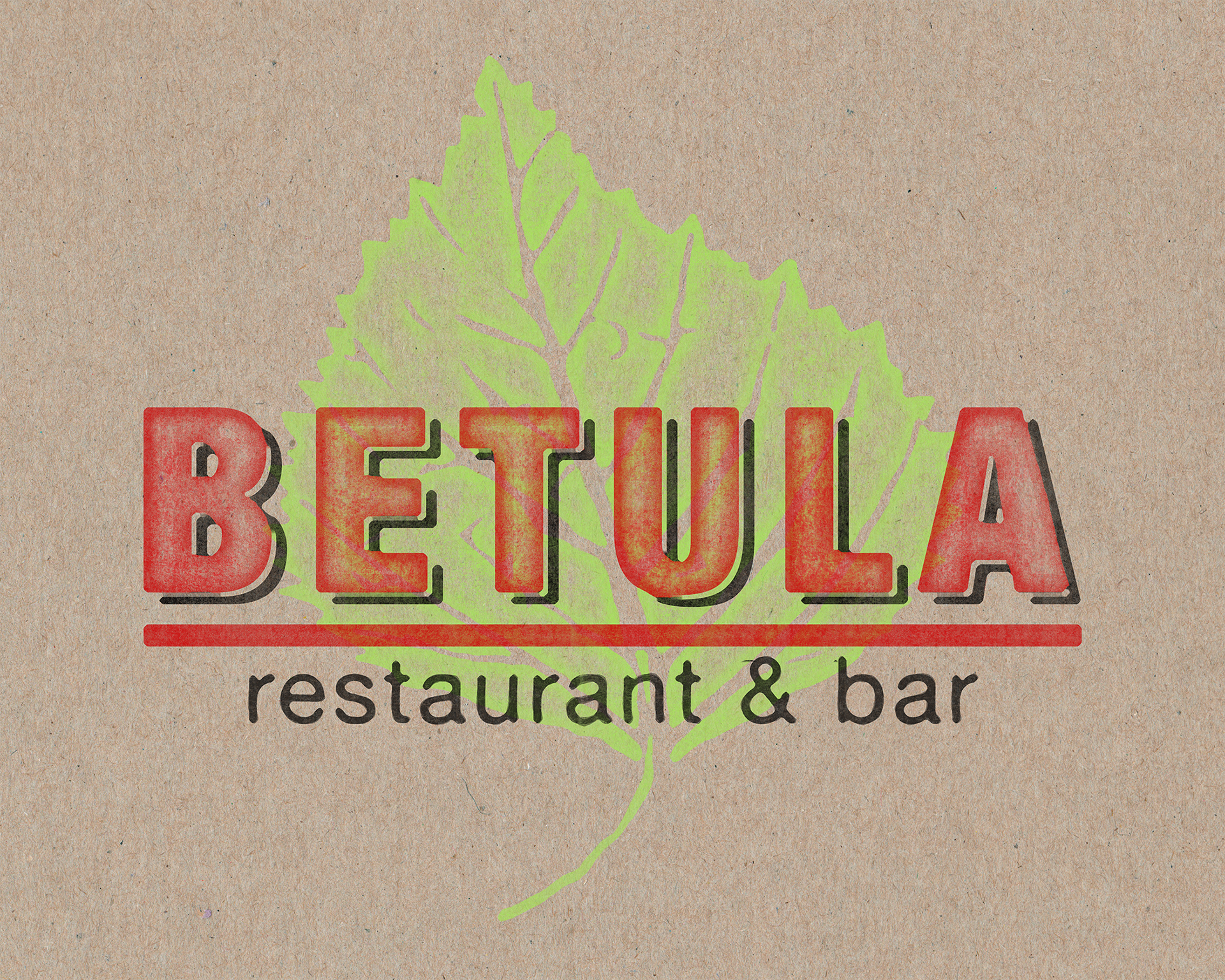
In the early stages of the project, the client completely changed their mind and decided that instead of a steak restaurant they would only be serving vegetarian food. The client made the decision to change the name of the restaurant from “Birchwood” to “Betula” which is the latin translation for “Birch Leaf”. I needed to create a new design that reflected these changes. I decided on a timeless feeling type treatment that evoked classic sign painting. Another challenge was to translate the foreign word “Betula” to customers. I made the decision to literally illustrate a birch leaf to be used as a design element for the brand.

After seeing my design, the client decided they wanted to change the overall feel of the restaurant once more. They decided to stray away from the rustic aesthetic and instead opt for a more modern trendy feel to attract younger clientele. For this new design, I used the texture of the bark of a birch tree for inspiration. I was able to create a logo that suggested a forest of birch trees using negative space.


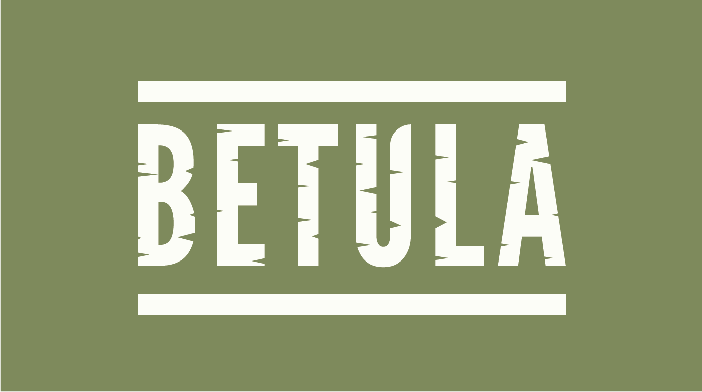
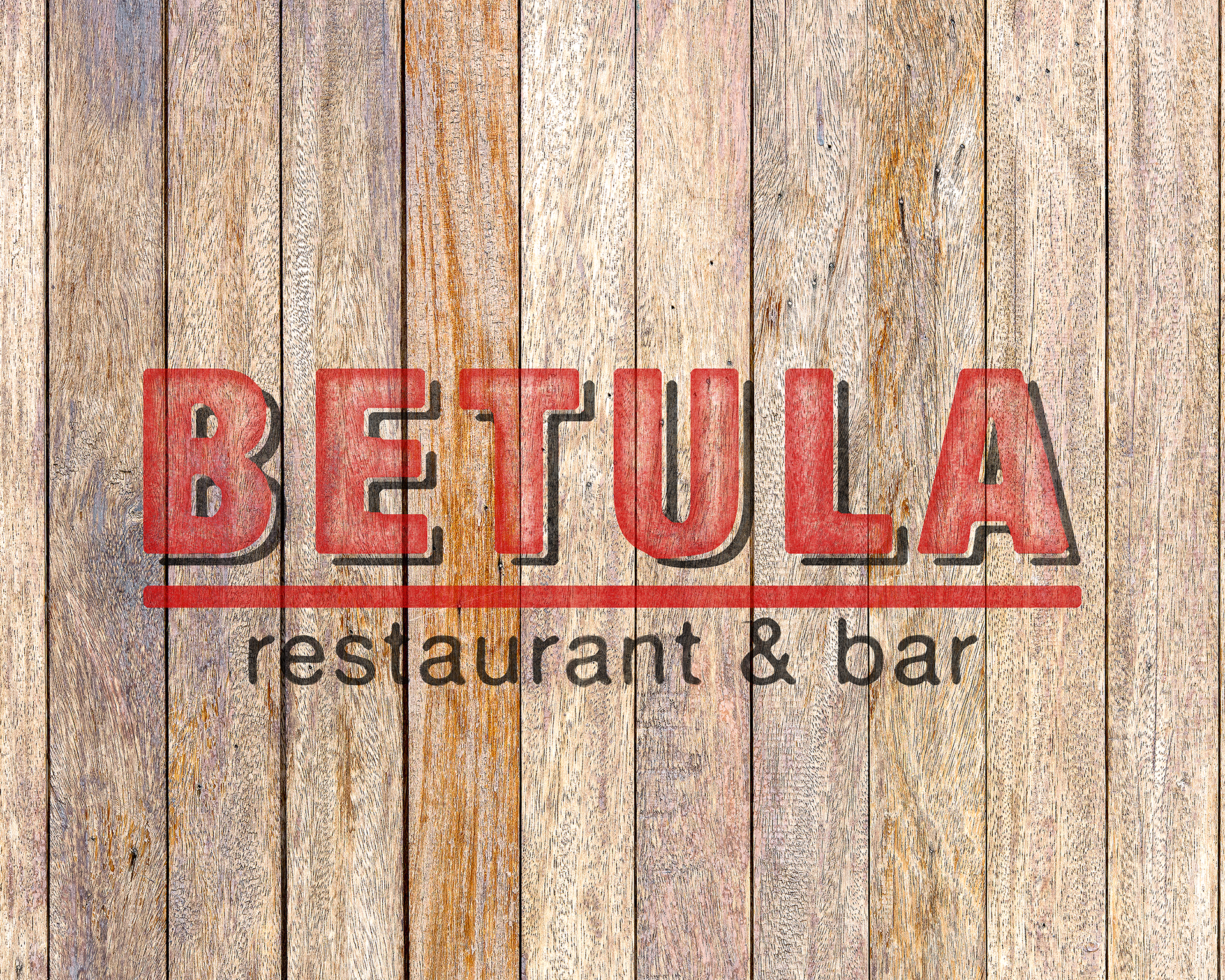
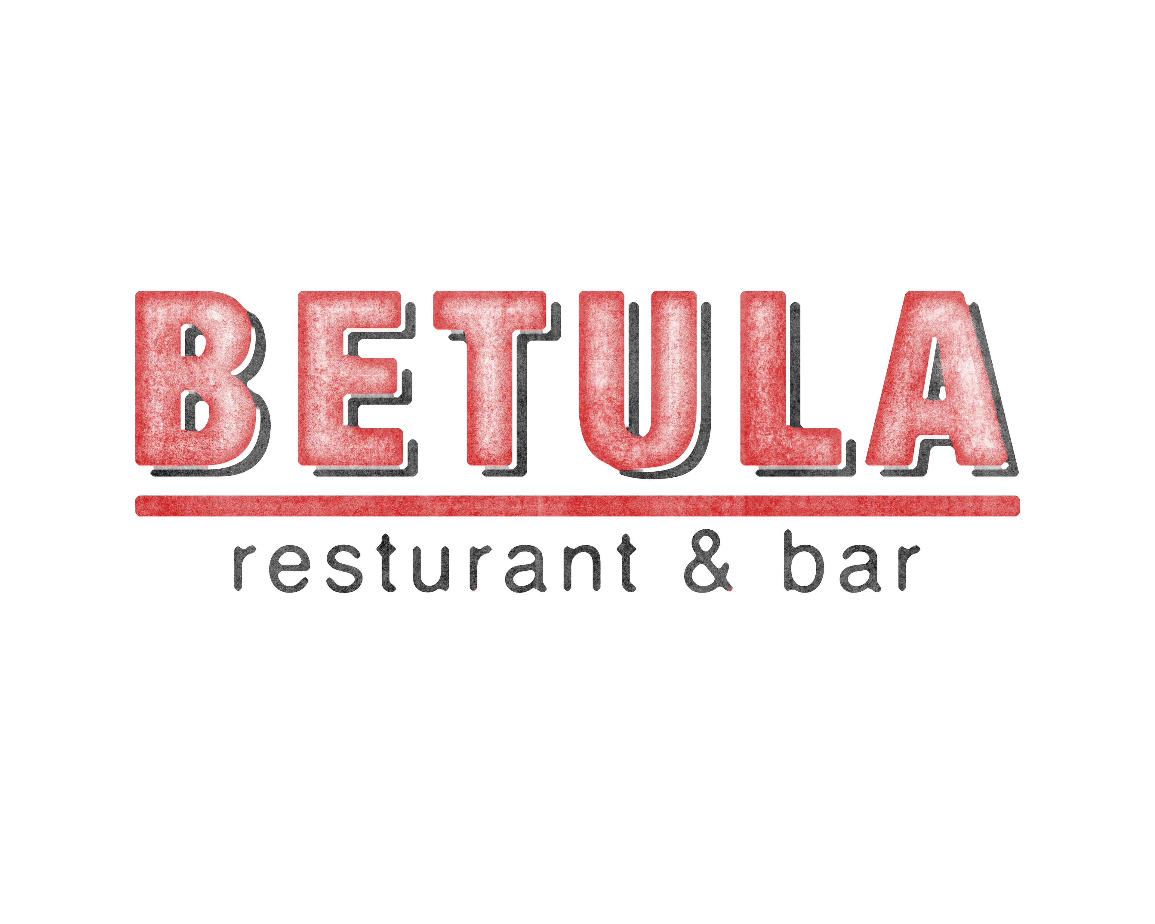
After seeing this design, the client was confused by the use of negative space and felt that the “forest of trees” read too much like vines. For my last attempt, I once again took inspiration from birch bark texture, but this time chose to incorporate this into the logo. The client was pleased with this logo and asked me to begin to create branding materials for the restaurant. Unfortunately, due to financial reasons, the development of the restaurant was put on hold.